
Hank Ewbank’s portfolio
2024
C/O: McGarrah Jessee
Branding, Illustration, Art direction, web design
Hello, McGarrah Jessee! Below, I’ve curated six recent projects that I think are most relevant to your specific description of Senior Designer, and the best showcase of my capabilities. If you’d like, I’m happy to provide additional work upon request. Thank you for taking a look!
Note: some of the work below is sensitive, and I would ask that it is kept as private as possible. Thank you.
Best,
Hank
The Co. Lab
2024
Branding, UI, Illustration, a little animation
Client: Maestro / Western Michigan University
Sleeping Giant Capital–an entrepreneurial firm within Western Michigan University’s Haworth College of Business–approached Maestro to brand and organize a conference targeting small-and-medium-business leaders in the southwest Michigan area. My responsibility was to act as the primary creative throughout, contributing to or leading naming, branding, visual identity, web design, and social content. The strategy was for a brand that reflected an exciting, inspiring, hands-on event that differentiated it from other SMB conferences.
The Co. Lab's final logo.
The landing page of the site, designed in Figma. Development by Tommy Day.

The Co. Lab, final logo family. The marks are based off of a modified version of DDC Hardware.
To add depth and texture to the visual identity, I created a library of illustrations. I took photos on my phone while walking around downtown Kalamazoo (the location of the conference), and then abstracted them into these duotone images using the brand’s color palette. While they may not be instantly recognizable as Kalamazoo, my hope was that I could evoke the city in a subliminal way. This technique ended up being applied to other imagery as a way to make stock imagery feel more engaging. Since this is the first Co. Lab, it has no existing event photography, but the visual treatment provides an ownable and recognizable look.


Assorted content for social media.
Social posts for The Co. Lab, (rudimentary) animation done by me.
Art direction for Target equity training
2023
Art direction, illustration
Client: Maestro / Target
Target approached Maestro asking for custom multimedia training on equity to be taken by all Target employees. As part of our plan, we would set art direction and hire freelance illustrators and animators to explain and illuminate some of the complex ideas in the course. My responsibility was to create example illustrations, write the direction documents, source illustrators, and be the liason between our illustrators and client feedback (while providing feedback of my own).

Illustrations created for art direction reference.
With the sensitive nature of the material, it was crucial that no details in the pieces could have their meanings misinterpreted by the audience. Additionally, Target wanted the illustrations to feel gritty and “real” without being overly harsh, cynical, forced, or cliched and overly optimistic. To support this, I created a sample library of photos, colors, and visual motifs, all with intentional meaning related to the course’s themes. My goal was to create guidelines to keep the artists on the right track without overly restricting them.
Below, you can see a section of the deck created for our freelance illustrators. Design and copywriting by me.


The illustrators did excellent work, and the client was pleased with the end result. The course continues to be taken by all Target employees nationwide.

A selection of the final illustrations in context. Art by Dakarai Akil, Blake Cale, and Matthew Hancock (left to right).
Brand + blog illustrations for Maestro
2020—Present
Editorial illustration, brand illustration
Client: Maestro
For a few years, I’ve had the responsibility of being the main brand illustrator for Maestro, owning the development and evolution of the art direction for our different touchpoints. The majority of this work focuses on headers and in-post images for our blog content, spot illustrations for the website and brand emails, and supporting illustrations for our downloadable content and classes.

Article: How to Use the Learning Ecology Matrix to Make Better Learning
After being given the responsibility of creating the majority of illustrations for Maestro’s blog articles in 2020, I started gradually developing an ownable, recognizable style for Maestro’s content that still leaves room for experimentation. This expanded into brand illustrations for a website overhaul in 2021–22, as well as supporting illustration for Maestro’s other content and offerings (webinars, quizzes, downloadable content, workshops, etc.).
Most often, blog illustrations have a quick turnaround and limited hours (2-4) available to complete the work. I’m expected to read the content and then distill elements of it into a captivating image that potential readers are intrigued by. Content about the learning industry can be dry, so I prioritize making it appear vibrant and interesting at first glance. Creating these illustrations is an excellent challenge for me to experiment with different approaches while still being efficient. I mix vector illustration, hand drawn elements, photography, digital painting, filters, textures, and other techniques.

Article: How to Craft an Effective Learning Strategy

Article: 7 Workarounds to Make Components in Rise Accessible

Article: Can a Customized Approach to Learning Bring Out Your Team's Best Work?

Article: Authoring eLearning with Articulate Storyline
While the execution is digital, the look is inspired by historical illustration styles. It draws heavily from textbooks and old scientific book covers with restricted color palettes. To keep them grounded in the real world, most files are constructed so that they could go straight to a screen printer if necessary (not that this would ever happen). I add a little bit of life to everything with ink bleed effects and subtle textures. My goal is that anything from Maestro feels slightly untethered from a specific time in history.
Illustration for Maestro's Culture page. Animation by Tommy Grill.

Illustration for Maestro’s Disciplines page.

Illustrations for various landing pages.

Article: Microlearning—How Short Is Too Short?

Article: Malcolm Knowles’ Five Assumptions of Learners and Why They Matter
Article: Bite-Sized Learning, Demystified: The Benefits, Limitations, and How to Get It Right

Article: How to Plan for Seat Time Requirements (and Get It Right the First Time)

Article: What Visual Design Is and Why It’s Important
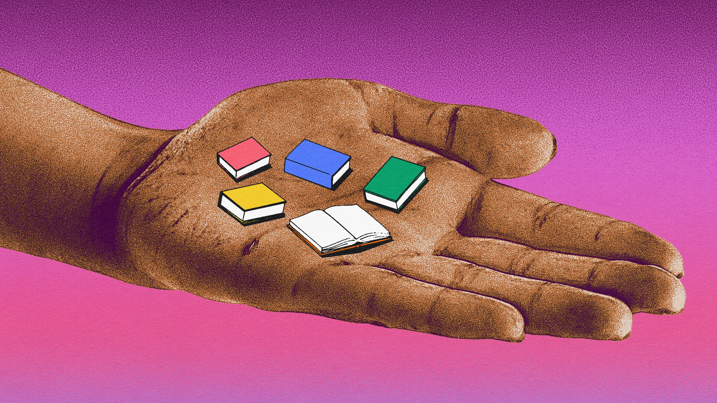
Carlos Whittaker
2022
BRANDING
CLIENT: MAESTRO / CARLOS WHITTAKER (AKA LOS WHIT)
Carlos Whittaker is an author, speaker, popular social personality, and self-proclaimed “hope dealer” with an online following of 3–400,000. Ahead of the release of his new book (How to Human), Carlos spoke at my office and formed a relationship with Maestro, leading us to be asked to provide him with a brand identity. I was tasked with being the lead designer, and presented my concepts directly to him throughout the process.
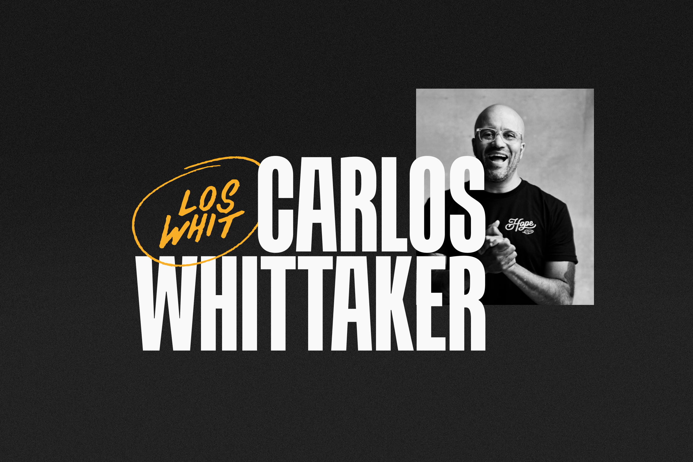
Primary logo (and Carlos).
Carlos’ content and persona finds people at the crossroads between left and right, minority and majority, secular and faithful—a reflection of his own diverse background. His infectious energy and vulnerability brings people in and makes them want to join together. I wanted to capture these contrasts of joyful and “real” feelings visually by mixing fonts, hand-drawn elements (called “Sparks”), and rich colors. The logos either reference his nickname (”Los Whit”) directly or use the Sparks to draw subtle attention to them while adding energy and movement to the lockups. Additionally, I produced some basic templates for Carlos to use for instagram graphics, some tone-setting brand expressions, and a few merchandise concepts.

Logo variations.

Visual identity elements.
Animated "Sparks", drawn in Procreate and finished in Photoshop.

Brand guidelines, social media content, and merchandise concepts. Brand guide copywriting and verbal identity by Jillian Lukas-Rodriguez.
Polly
2024
NAMING, BRANDING, UI DESIGN, ART DIRECTION
CLIENT: MAESTRO / INSMED
Insmed, a rapidly expanding pharmaceutical company focused on treating rare diseases, approached Maestro to create a branded internal site that could capture all of their compliance information in a friendly, easy-to-use, simple way. My creative responsibility was comprehensive – I assisted on naming the site (Polly, referencing “policy”, was a suggestion of mine), created the branding in compliance with Insmed’s existing brand guidelines, designing the UI of the site, and providing art direction for an animated video that debuted the product to the company.

Final logo and home page.
The logo mark is set in Insmed’s brand font, Sofia Pro. The accent over the O is meant to evoke illumination of information and give the logo a “smile”. The gradient colors are pulled from the Insmed brand palette. Alternate logos were explored, each one focusing on different expressions of friendliness, efficiency, information, and illumination. The logo is meant to be distinctive but still visually defer to Insmed’s primary logo.

Logo process. Inspo (short for “Insmed Portal”) was another suggestion of mine during the naming process, and was explored prior to the client choosing Polly.
The final desktop home page, designed in Figma. Development by Derek Brottlund. The live site is private.
An activity page, designed in Figma.
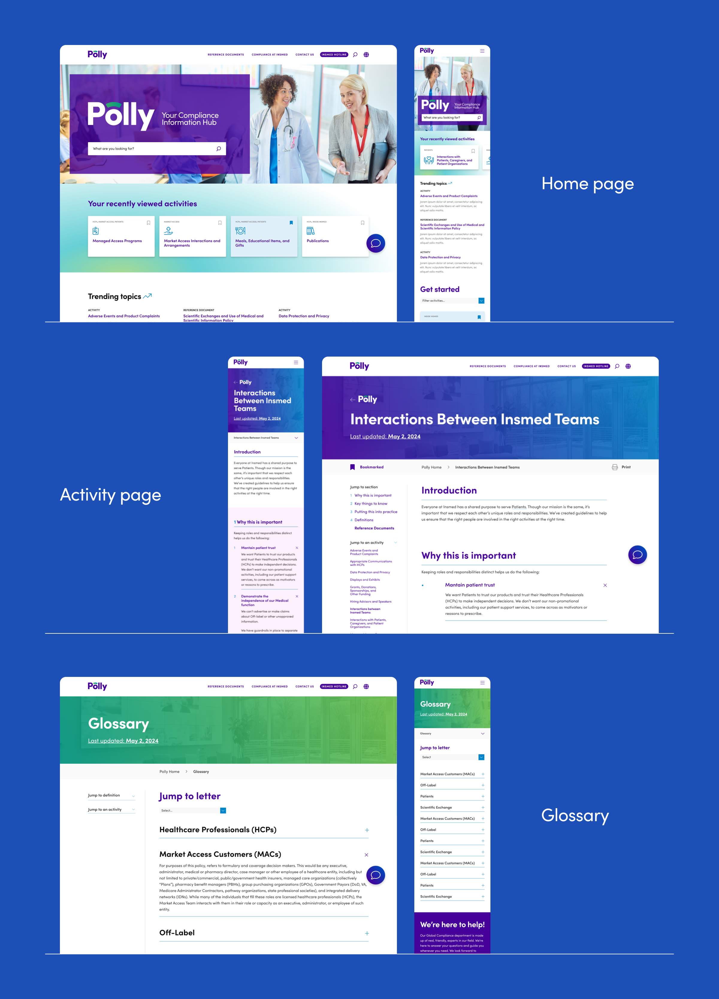
Selected page designs.
Once the site designs were mostly finalized, I provided art direction for an animation introducing Polly to Insmed employees. Storyboarding and illustration by me, animation by Inbar Kranz. She added a ton of great details.
Can design and illustration for Wax Wings Brewing Co.
2023-PRESENT
GRAPHIC DESIGN, ILLUSTRATION
CLIENT: WAX WINGS BREWING CO.
Wax Wings Brewing Co. is a craft brewery in my city of Kalamazoo. Their brewing style is experimental, prolific, and a little rough around the edges. They hired me to design a label after finding my work online, and we’ve been regularly working together ever since. Wax Wings gives me loose direction and then generally let me go crazy, which is obviously my preferred working method. I’m extremely grateful for them and their trust in me.

Kalamazoo’s Finest
The request was a beer that felt like an old classic lager. The texture on the label is an illustrated map of the city from 1908 that was found on the Library of Congress’ website. The peregrine falcon is an original illustration by me, inspired by the pair that has nested in downtown Kalamazoo for the past decade. The final can print uses metallic elements for added excitement, as shown in this mockup.

Kalamazoo Skyline IPA
The label features an illustrated scene of Arcadia Park in downtown Kalamazoo. The piece is currently also sold as an art print at the bar.

For the Dogs IPA
This beer was brewed in partnership with the Southwest Michigan SPCA, and a portion of all sales support their efforts. For the design, I created illustrations from photos of actual dogs at their shelter, including their real names as well. These beers are sold as a 4-pack, with one of each dog included. Original photos by DH Images.

The Comeback Kid IPA
One of the brewers at Wax Wings – Andrew Evans – is, amazingly, a 2-time Olympian discus thrower. He just qualified for the Paris olympics, and Wax Wings wanted to release a beer in his honor with a very quick turnaround. I was given the privilege of designing the label.

Various images of the final products.